Analytics
Introduction
The Analytics Dashboard, reachable from the main navigation menu of the portal under "Analytics", shows the trend over time of the identifications made through AutomatID.
Below an example screenshot of the Dashboard:

How to set up the Analytics Dashboard
You can set up the analytics dashboard as you like by interacting with the filters you find in the header. The default dashboard is set according to the following parameters:
- Projects and Apps → All
- Period → Last 30 Days
- Frequency → Daily
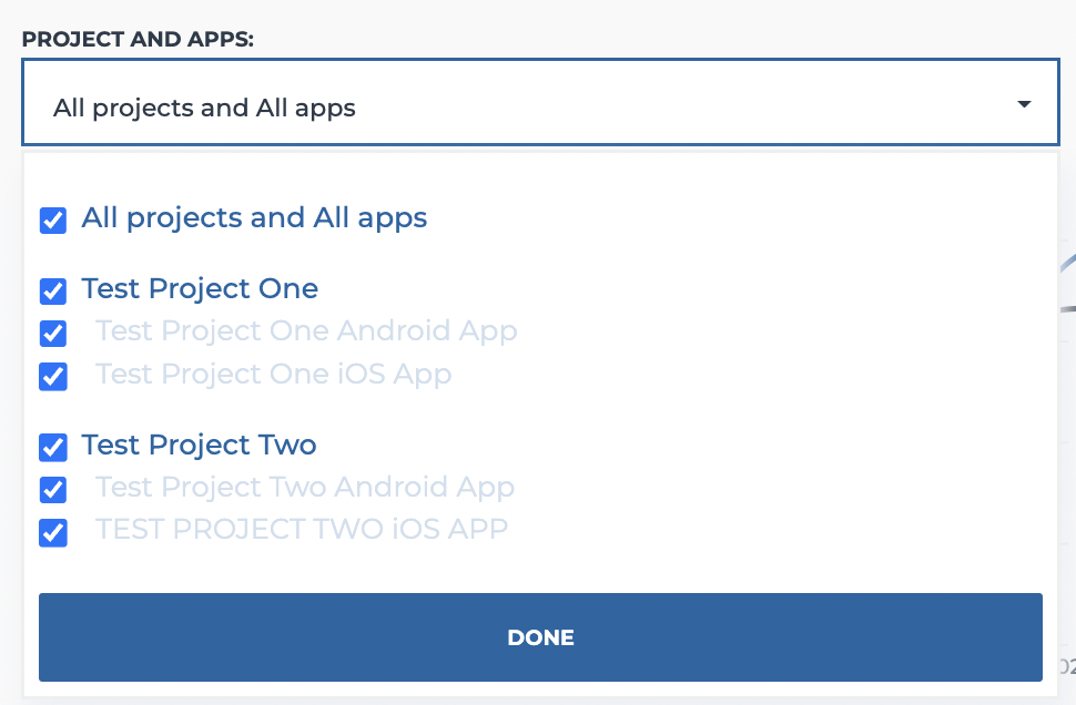
The "Project and Apps" filter allows you to select the projects or specific apps for which you want to monitor the performance. To select the projects and the apps you have to flag those you are interested in by interacting with the dedicated dropdown component:
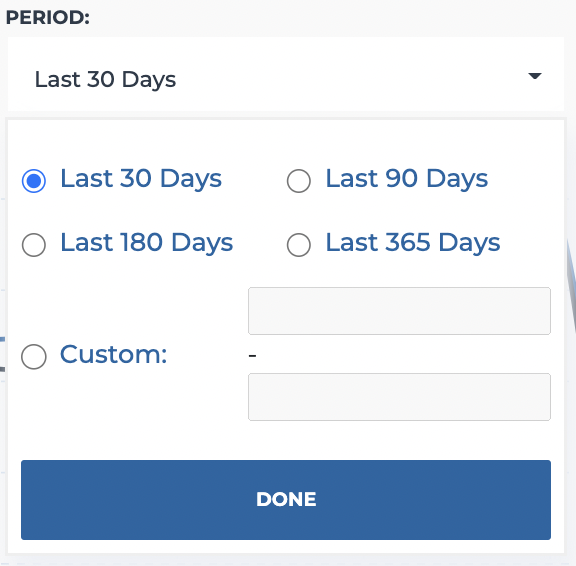
The period to be analyzed can be set through the "Period" dropdown. This filter shows four default options: "Last 30 Days", "Last 90 Days", "Last 180 Days" and "Last 365 Days". If you are interested in a Custom period you have to select the "Custom" option and then enter the starting and the ending date in the format "MM.DD.YYYY".
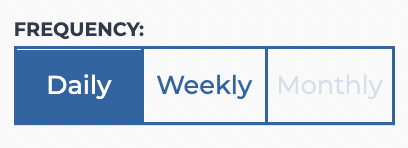
Finally, you can also select the aggregation frequency of the data to be analyzed by interacting with the tab-bar at the top right, choosing between daily, weekly and monthly. Not all frequencies are always available. In fact, since the sampling frequency also defines the number of points that will make up the performance graph (see next paragraph), the rule will be followed that the number of points (N) must always be between 3 and 62 (3 ≤ N ≤ 62). If a sampling frequency returns a number of points lower or higher than the range thus defined, this frequency will be disabled and not selectable.
Performance over time graph
According to the settings (as described in the previous paragraph), the system will show you a double line graph representing the performance over time. The graph compares the trend of the total identification requests (represented with a light blue line) with the trend of the identifications actually completed (represented with a dark blue line). This graph is built showing the time periods in the horizontal axis of the abscissa, and the absolute value of the number of requests made / completed in the vertical axis of the ordinate.

Table of Values
Below the graph a table of values is shown. The columns of this table are:
- Period → it indicates the period the values of the row are referred to
- Total Requests → it is the absolute number of requests in the period
- Successful Identifications → it is the absolute number of successful identifications in the period
- Completion rate → a value that indicates the percentage of the identifications completed. It is calculated through the following formula:
C = (Successful Identifications / Total Requests) * 100
and the results are presented in 3 different colors, green, orange or red, according to the following rules:
- 0%≤ C ≤ 33% → Red color
- 34%≤ C ≤ 66% → Orange color
- 67%≤ C ≤ 100% → Green color
By interacting with the arrows that are displayed in the title of each of these columns it is possible to sort the rows in ascending or descending order accordingly. By default, the rows are presented in descending periods, from the most recent to the earliest period.
